stop the urbanity: an article
Overview
stop the urbanity: the marriage of architecture and typography is a self-edited blend of two articles, bringing a deeper perspective into the relationship between human emotions and the urban environment in which we reside. Read the full article here.
Tools
- Adobe InDesign
- Adobe Photoshop
Time
September – October 2020
Background
Typography at Cal Poly, SLO
This project was made for a Digital Typography course at Cal Poly, San Luis Obispo. Taught in the Graphic Communication department by the renowned Lorraine Donegan, this course focuses on the thoughtful and appropriate application of typography for various digital and print outputs.
Requirements
A Type of Prompt
For this project, students were required to combine two or more articles that are related to typography into one cohesive multi-page document. Each page (besides the title page) needed to have at least one image, one section header, and one sub-section header.
Research
For the Love of Buildings!
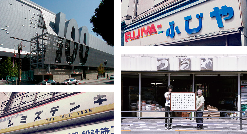
Thanks to my father’s constant home-renovating and my older architect sister’s career, I like to think that I am extra-aware of the built environment around us. Type seems to be a naturally 2-dimensional phenomenon; however, you can find it on the streets easily. Through this edit of articles, I sought to answer the question, “how much do type and buildings share in common?”
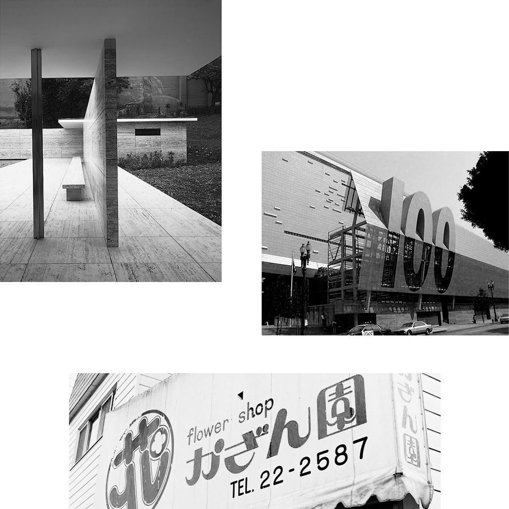
Upon searching the internet, I found two articles of interest: Virginia Smith’s 2006 article for AIGA, “Architecture and Type: A Modern Marriage”, and Mariko Sugita’s 2019 “Urban typography: a glimpse into a world of local typefaces in Japanese cities, and their survival”. Smith and Sugita connect architectural form with type, and type with the humans that produce them.
Solution
Ready, Set, Type!
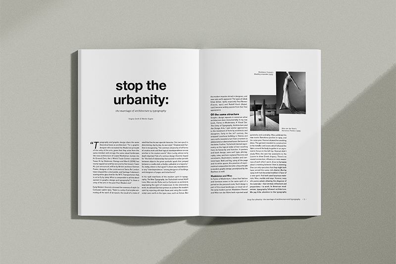
As outlined in the requirements, Smith and Sugita’s articles were edited together into one essay. However, the true purpose of this assignment was to exercise digital typography skills.
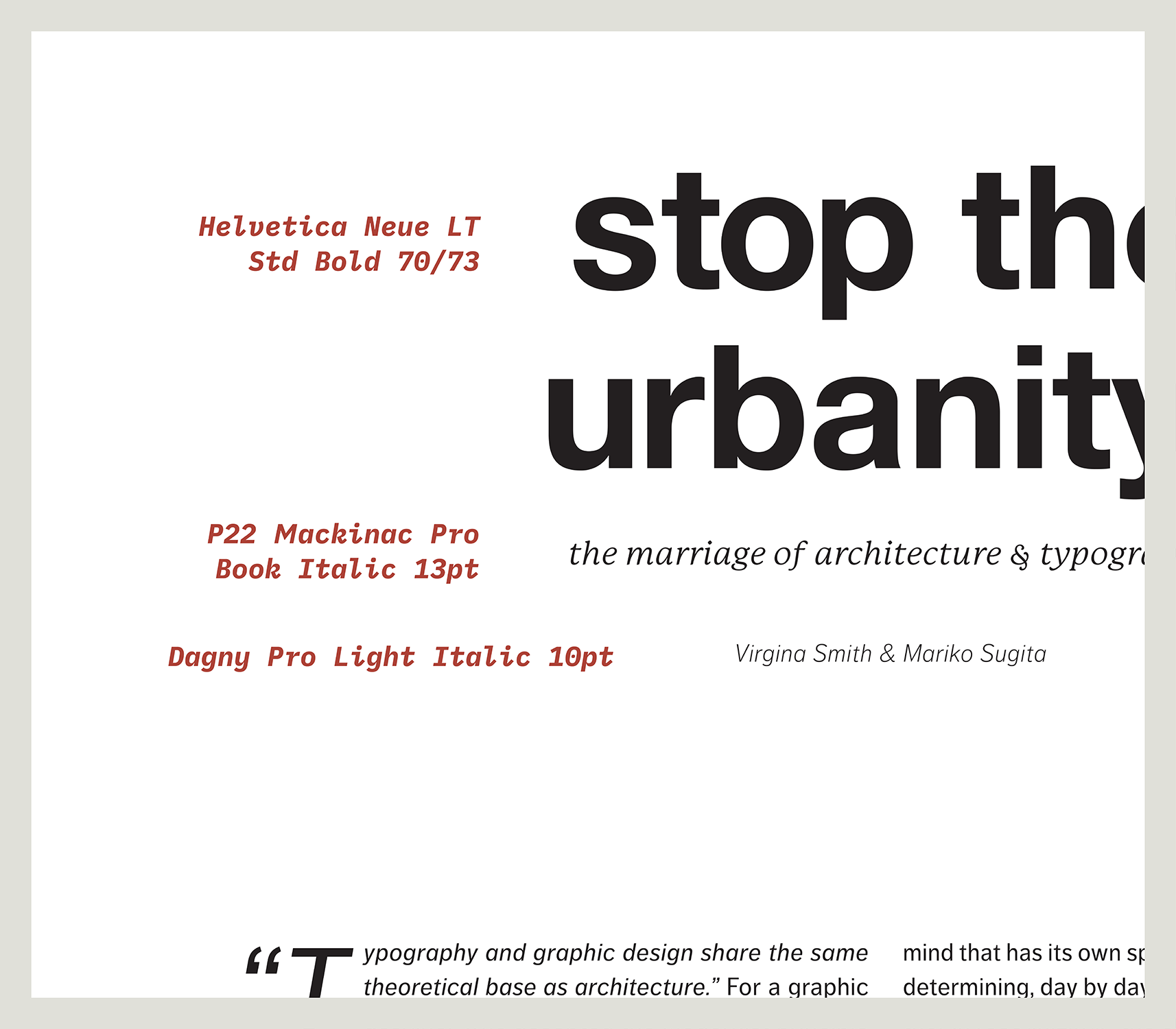
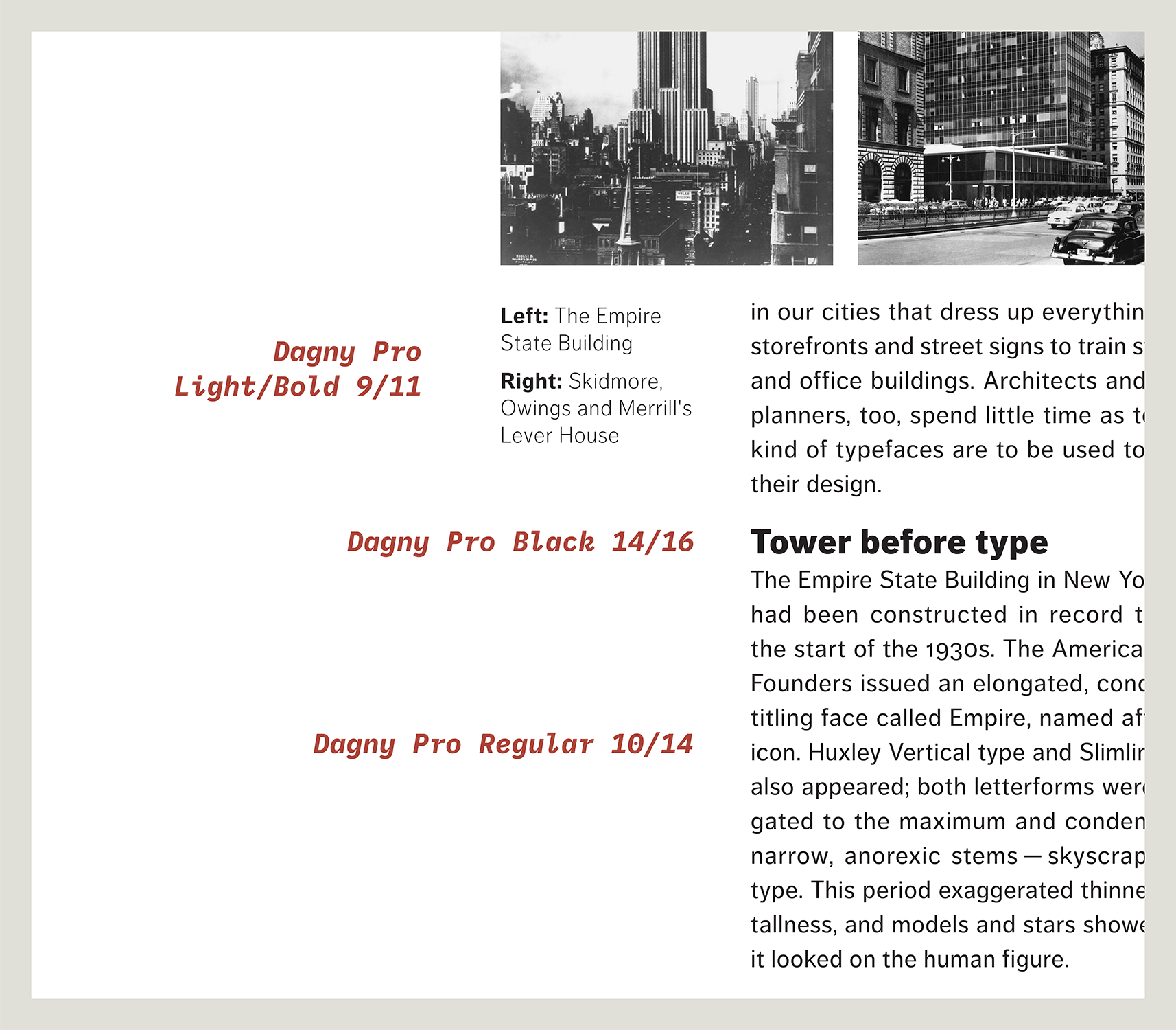
Helvetica Neue headlines as the title text—a nod to Helvetica’s widespread influence in New York City that Smith notes in her original article. P22 Mackinac Pro takes stage as the subtitle as well as the footer typeface. The remaining content of the article is set with Dagny Pro in various forms. Dagny Pro was chosen as the content typeface because of it’s slimmer silhouette and taller-than-average x-height that reflects the skylines of New York City and Tokyo, two metropolises that are referenced in the text.
Lessons Learned
An Emotional Attachment
When designing something out of your own mind, it is easy to become emotionally attached to the result and take any criticism personally. While I held the power of Creative Director over this project, the outcome would have been unsavory if I did not receive critiques from my peers, notably Kay Quijano and Jake Oxenham. The images found on each page of the article were originally in color, but were switched to black-and-white after peer feedback. The hope with that decision was to focus on the form—of the architecture and type. Additional skills honed thanks to this project were layout designing in Adobe InDesign, internal file hygiene and organization, and rummaging through (virtual) mounds of typefaces to reinforce a message. Thanks to Lorraine Donegan for providing instruction.
::