Racetrac Mobile App
Overview
Tasked to bring a telecommunication company’s bill payment interface into the modern age, myself and two others conducted target market research, a brand refresh, and produced print, web, and mobile experiences for customers to pay their bills and check account status.
Tools
- Framer X
- Pen and paper
Team
Mika Arie, Yenna Chen
Time
January – March 2020
Background
Xplor International, 2020
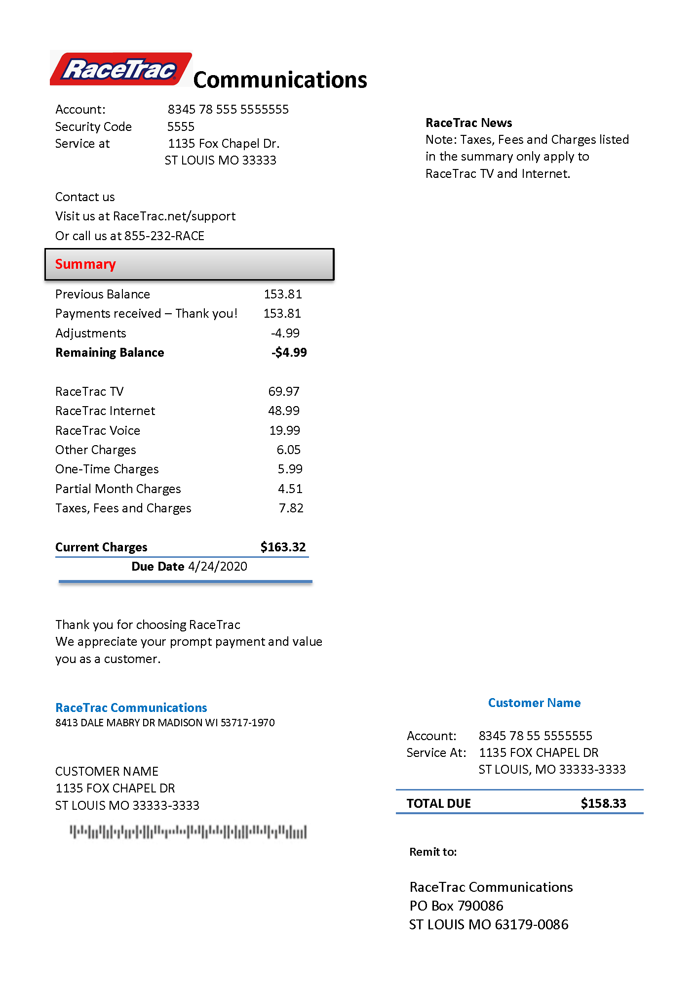
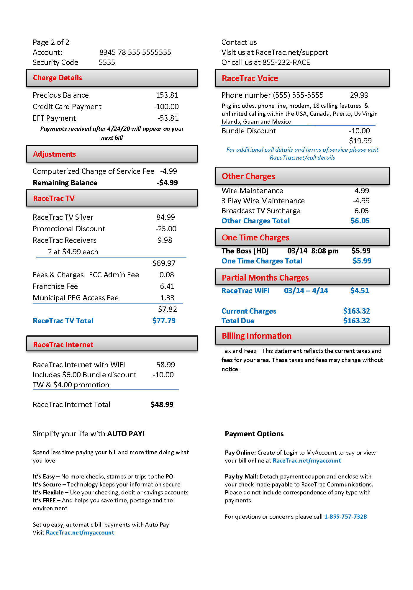
This project was submitted into the Xplor International Conference student competition which called for a cohesive print, web, and mobile experience. Starting from a single-page printed phone bill and some requirements, we had to ensure that each new medium we introduced would be on brand with the existing products.
Additionally, we were charged with “the challenge of redesigning it with the intent of making it more functional, aesthetically pleasing and expanding its purpose to include making the communication a marketing opportunity,” reflecting realistic business goals.
Research
Who Pays the Bills?
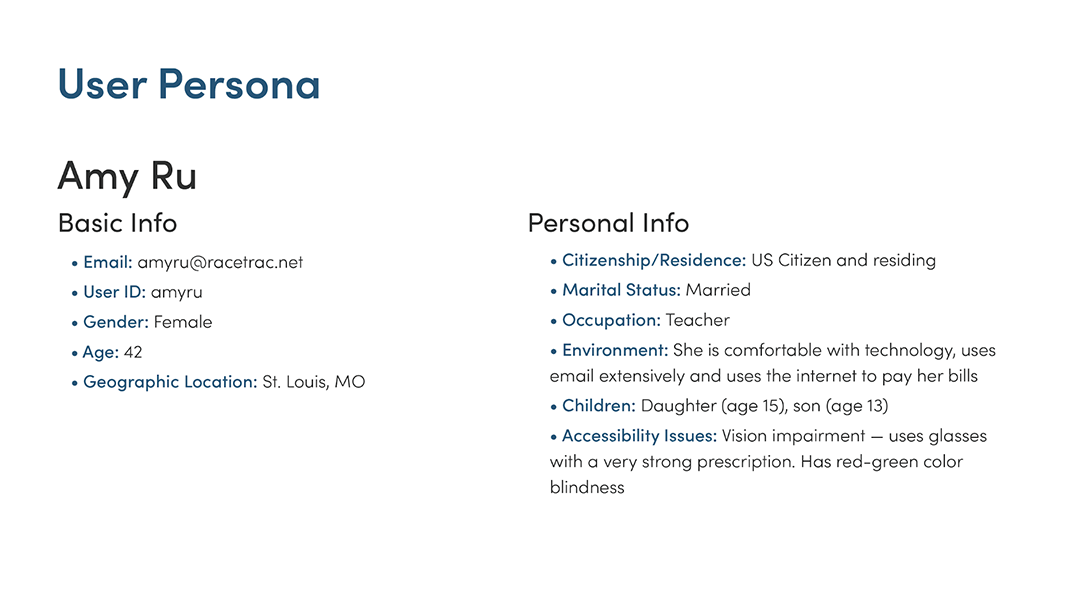
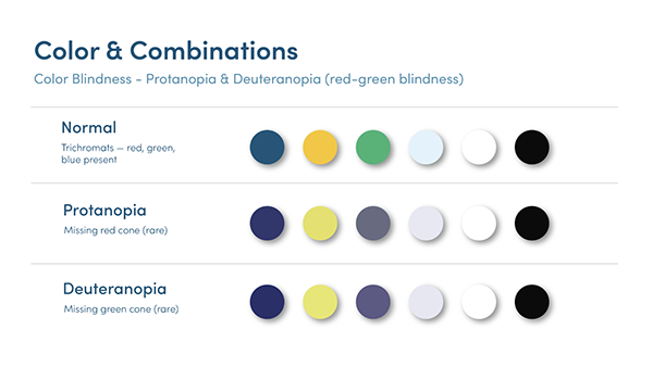
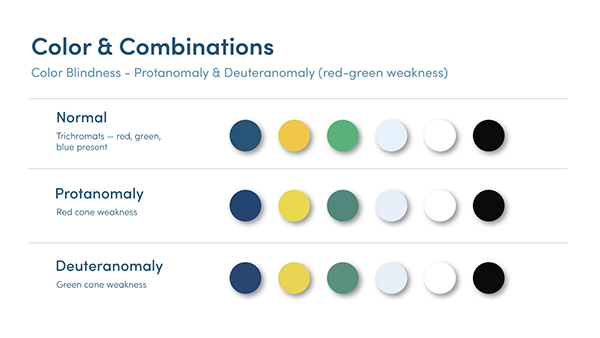
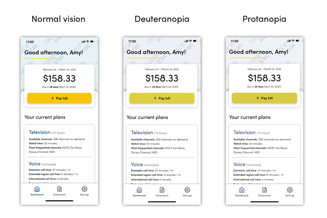
Researching deeper into RaceTrac’s target audience, we found that among heterosexual couples living together in the USA, women are slightly more likely to handle paying the bills than the men (Gallup, 2019). Based on this, we created a user persona, Amy Ru, who is a married woman who works full-time as a teacher and has two teenage children. Unfortunately, Amy lives with a red-green colorblindness, also known as deuteranopia.
Brand Refresh
Accessibility First!
Accessibility was our primary focus in this brand refresh. The graphics and colors that we used had to be easily distinguishable as a small icon and to people with color blindness. Yenna Chen created a new logo to replace the existing early 2000s era logo used on the supplied printed bill. This logo better reflects the company’s purpose and brings it into current times.
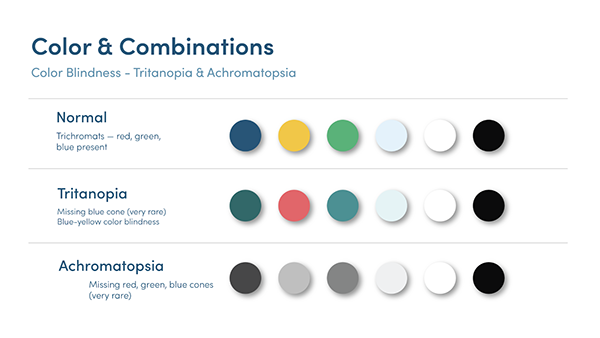
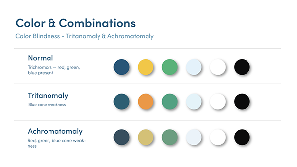
For new brand colors, chose colors that are modern and professional with a hint of excitement and speed. Our colors were tested through all of the types of color blindness for suitable contrast when viewed by any person.
Mobile Experience
What Are We Making Again?
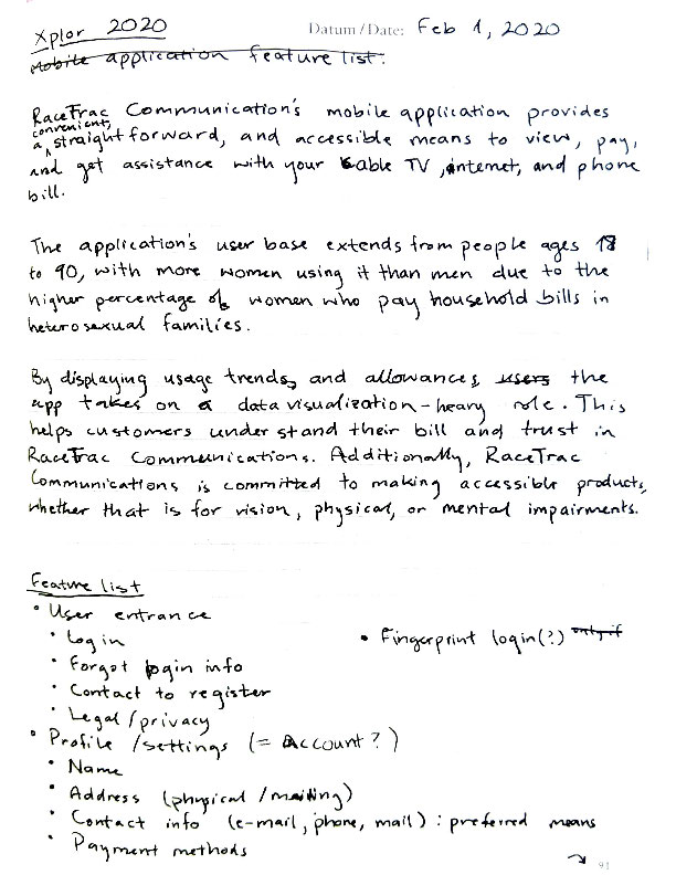
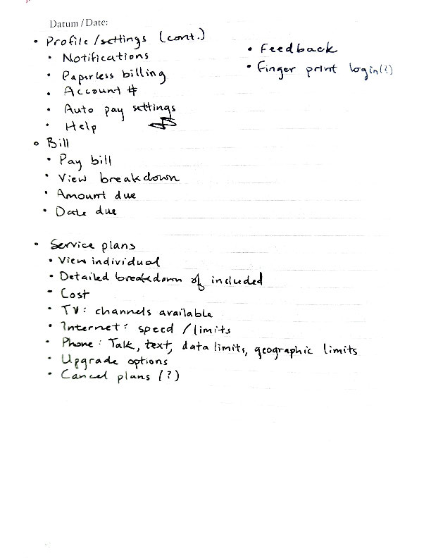
After we knew who we were designing for, why, and what limitations we needed to keep in mind, I began designing the mobile application experience. As a new platform for RaceTrac, there was no precedent for what the mobile experience should be. After reiterating the product goals, I wrote out a list of features that should be included in the mobile application.
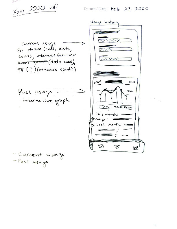
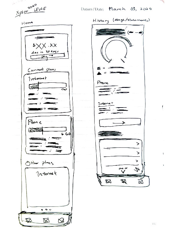
Pen First, Cursor Later
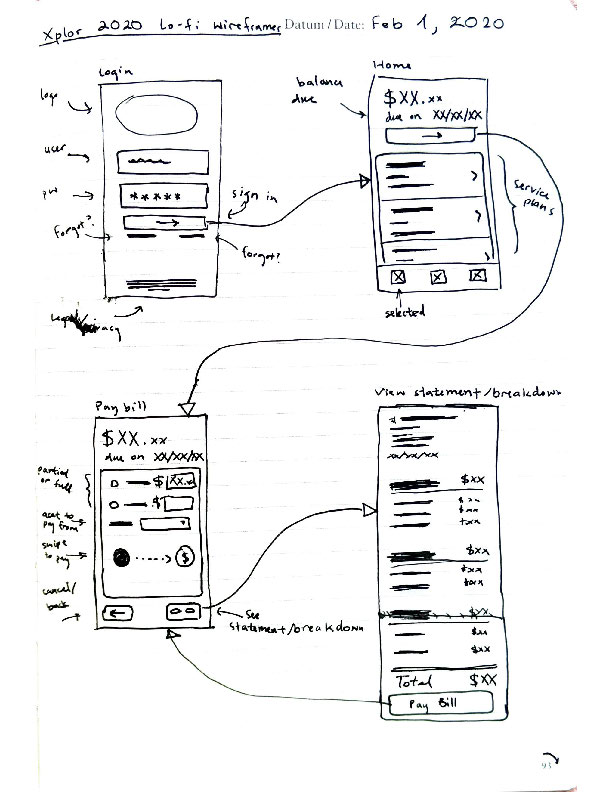
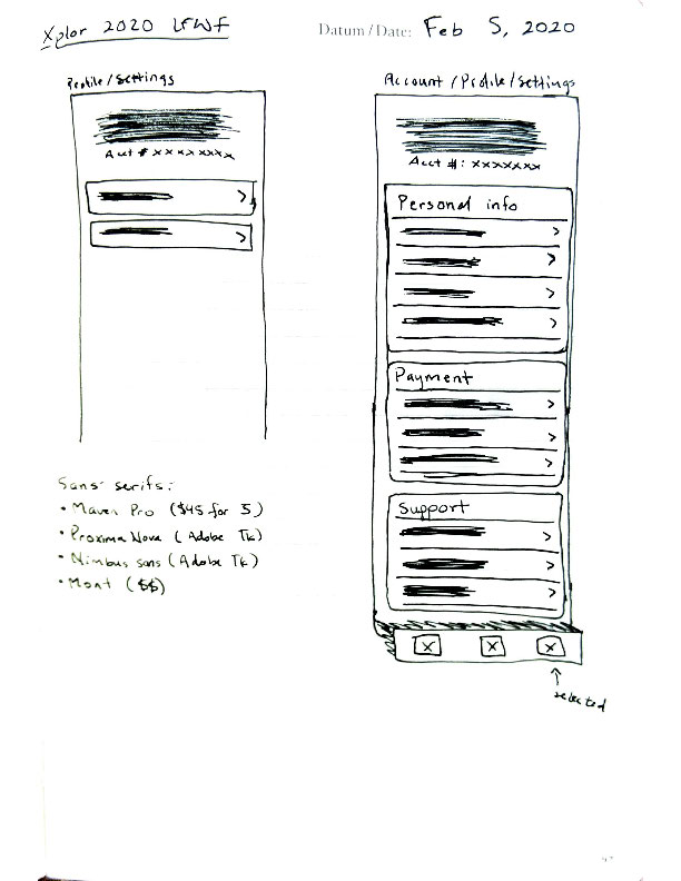
My preferred process is to sketch wireframes with pen and paper, because my mind is not distracted with aligning elements to guides or technological hiccups. Using a pen instead of a pencil helps me to be more intentional with what I am sketching out, and forces me to draw new sketches instead of erasing and drawing over the same.

Mid-Fidelity in Framer X
Once the wireframes were sketched out, reviewed, and validated, I digitized them in Framer X. Being the first big project that I employed Framer X for, I spent a substantial amount of time figuring out the nuances and using the community-made plug-ins. At this time, Framer was still in the early stages of public release and there were many bugs encountered in this process. I stuck with Framer X for this project because I was determined to become familiar with it.
Due to problems encountered with plug-ins, I was unable to include the interactive graphs and data visualization in the prototype that I had initially planned for.
Give Me a Hi-Fi!
Implementing our new branding guidelines, the high-fidelity prototype was completed in Framer X with animations and interactivity. This recording is a walk-through of the sections that were submitted to the Xplor competition.
Deep Dive
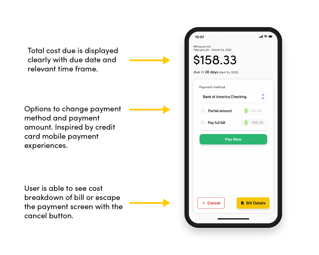
Screens In-Depth
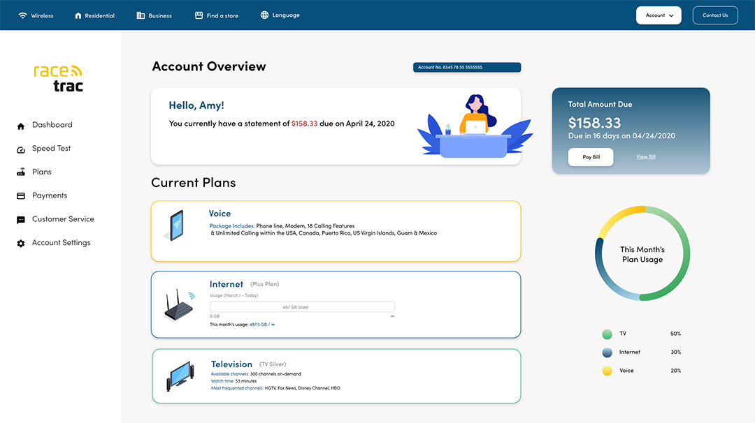
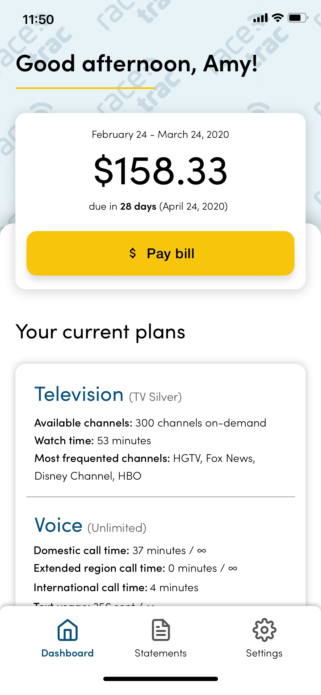
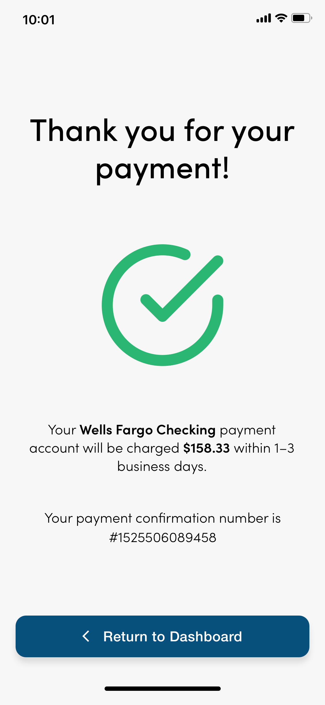
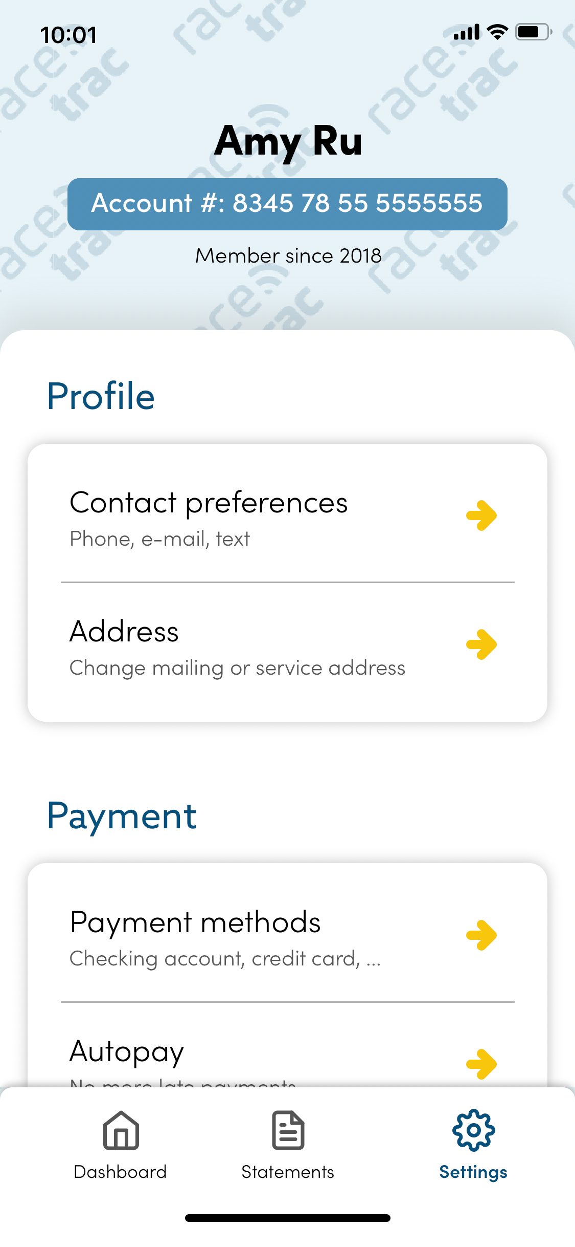
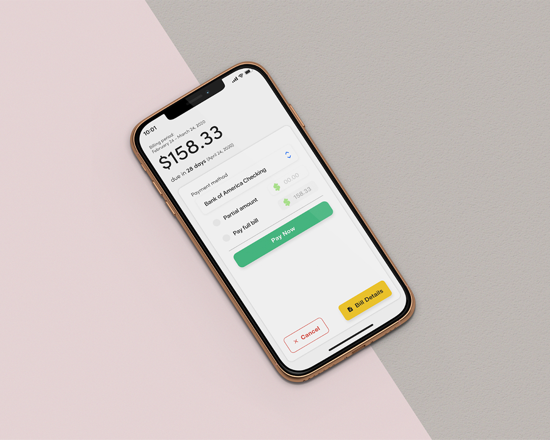
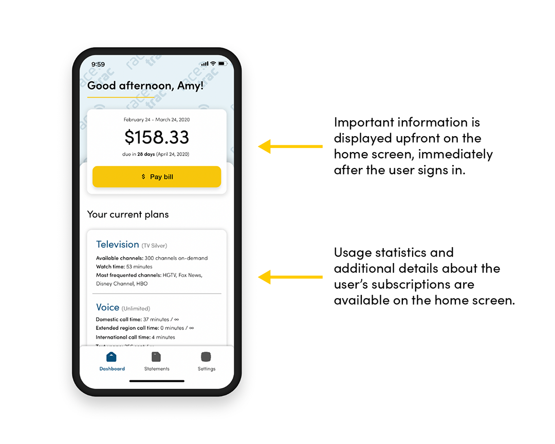
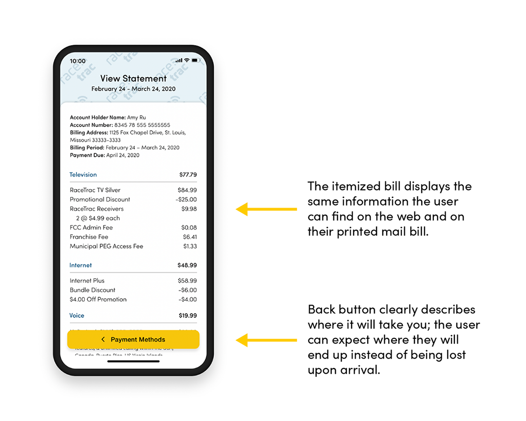
With functionality in between the mail-in printed piece and the website, the mobile application features the ability to pay bills, check current usage, view statements, and contact support. For more complex operations, accessing the website is necessary.
Validating Accessibility
Inputting the mobile screens through a color blindness simulator, we verified that the application is accessible in terms of color. The outstanding bill to be paid stands out on the home screen because it is the most urgent matter, and likely what users will be accessing the application for.
Across the application, animations depict a changing state or to delight the user. After a long day of work, paying the bills is not the most fun thing to do. If RaceTrac can offer a pleasant experience, then customers are more likely to be engaged, pay attention to the details of their account, and be loyal to the business.
Lessons Learned
Warning: Teamwork Required
This project involved defining business goals, researching the target audience, refreshing the brand identity, and applying the brand guidelines to create a cohesive experience across distinct platforms. I discovered new tools to use for accessibility testing and how important it is to have user personas that encompass edge cases.
Since this project, I have not used Framer X because of all of the bugs encountered with the software; however, I have lightly used the developer’s newer program, Framer Web, which is much more usable and just as powerful.