Data Management and Visualization
Overview
The following screenshots and files are projects from a data management and visualization course taken in the Fall of 2021. Skills learned include data cleaning, table relationships, Excel lookups, and Tableau visualization.
Tools
- Microsoft Excel
- Tableau
Time
September — December 2021
Contents
Basic Excel
Basic Excel
This basic cost estimating spreadsheet features drop-down menus (data-validation) linked from another sheet through named ranges. Additionally, errors are caught through IFERROR() functions, preventing the user from breaking the spreadsheet.
Contextual Menus
Excel: Contextual Menus
The same spreadsheet as above includes another sheet which serves as a personal budget tracker. This tracker uses contextual menus (validated from tables in another sheet) with the INDIRECT() function to direct the user toward the appropriate selection. IF() and IFERROR() functions keep the sheet clutter free when no entry is present. Additionally, conditional cell formatting clarifies the state or purpose of a cell.
![]()
Pivot Tables
Excel: Pivot Tables
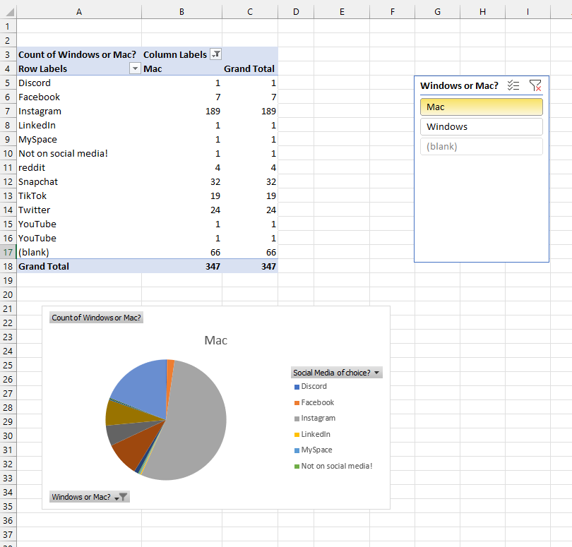
A collection of 350+ data points from previous Cal Poly Graphic Communication students was cleaned, aggregated, and organized into pivot tables. On one sheet, I evaluate the preferred social media platforms with a filterable pivot table and associated pie chart.
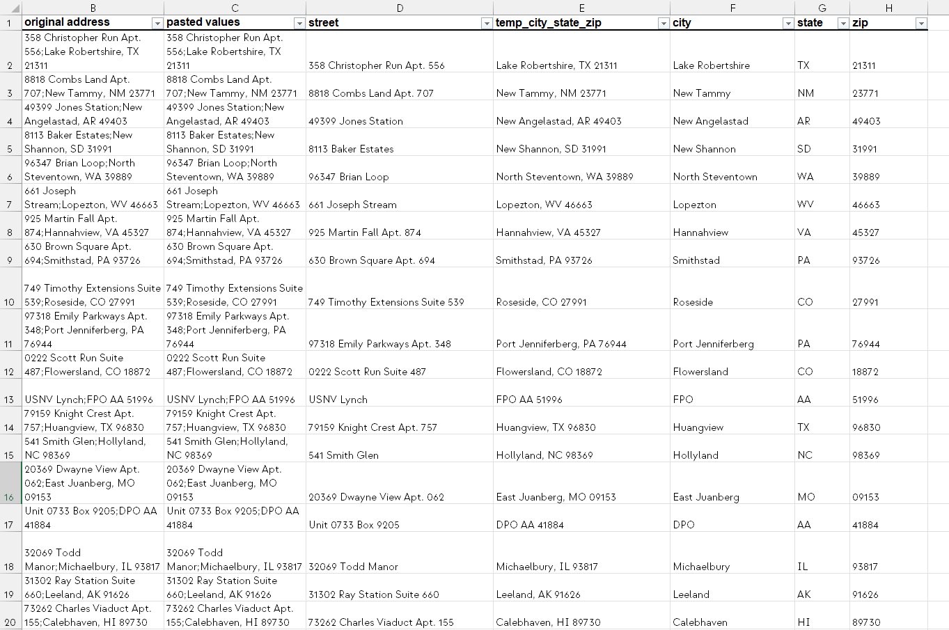
Data Cleaning
Data Cleaning
This spreadsheet of 5000 randomized data points from the Faker Python library includes fictitious names, titles, addresses, and contact information. All of this data was batch cleaned in Excel. In order to clean the data effectively, some techniques used were text-to-columns, SUBSTITUTE(), TRIM(), and SEARCH() with named groups.
VLookups
Excel: VLookups
Moving from simple context menus to referencing large tables, this spreadsheet employs the VLOOKUP() function with a MATCH() to find the associated value from 20x7 table array. This requires defining the proper named ranges as menus, lookup arrays, and table arrays.
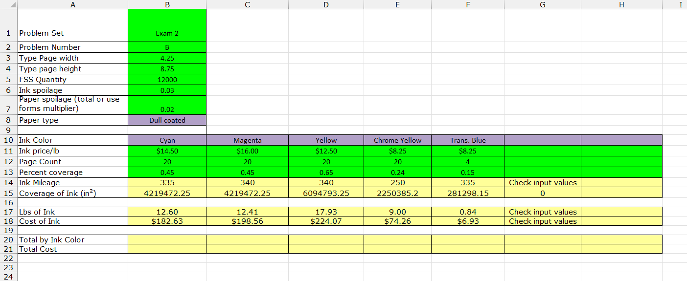
Advanced Lookups
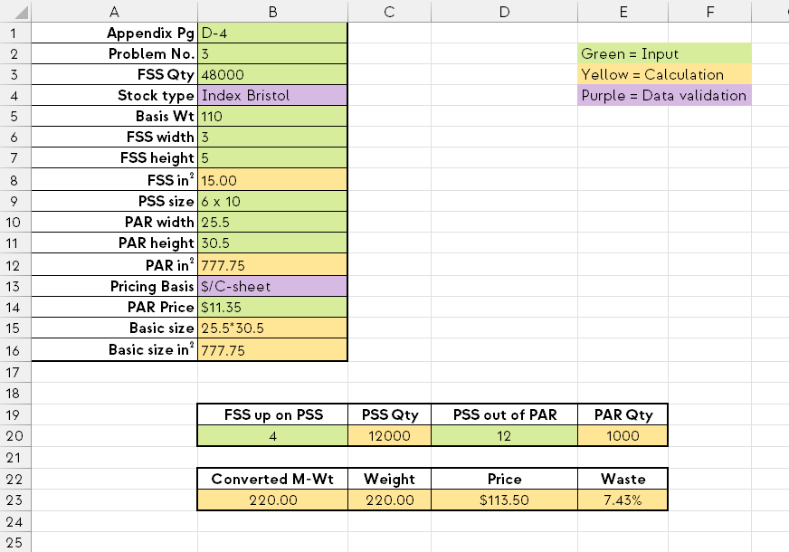
Excel: Advanced Lookups for Cost Estimating
Previous practice with VLOOKUP(), MATCH(), and conditional formatting are put to use with this book graphic design cost estimating tool. This spreadsheet builds on the last with the addition of HLOOKUP() and conditional data using AND/OR/NOT booleans. Data from tables across four sheets can be accessed on the main worksheet through drop-down menus, context-sensitive menus, and automatically updating time and labor cost cells.
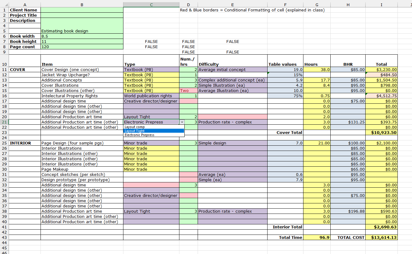
Tableau Prep
Cleaning and Joining in Tableau Prep
A data set of 10,000+ rows and 14 columns were cleaned, joined with another set, and outputted to a .hyper file for use in Tableau.
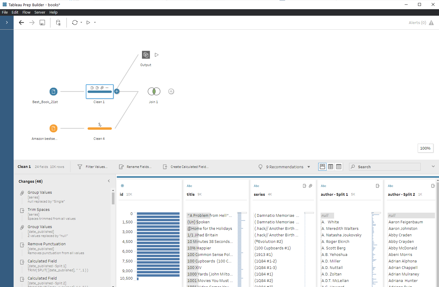
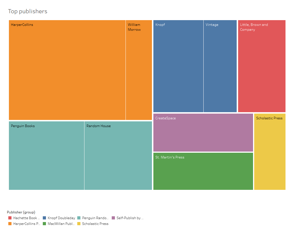
Tableau Tree Graph
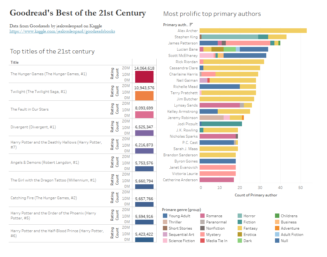
Tableau: Tree Graphs
From the above cleaned data, a tree graph was made to display the most frequently occurring publishers in the top books of the last 50 years (according to Goodreads).
Airbnb Filters
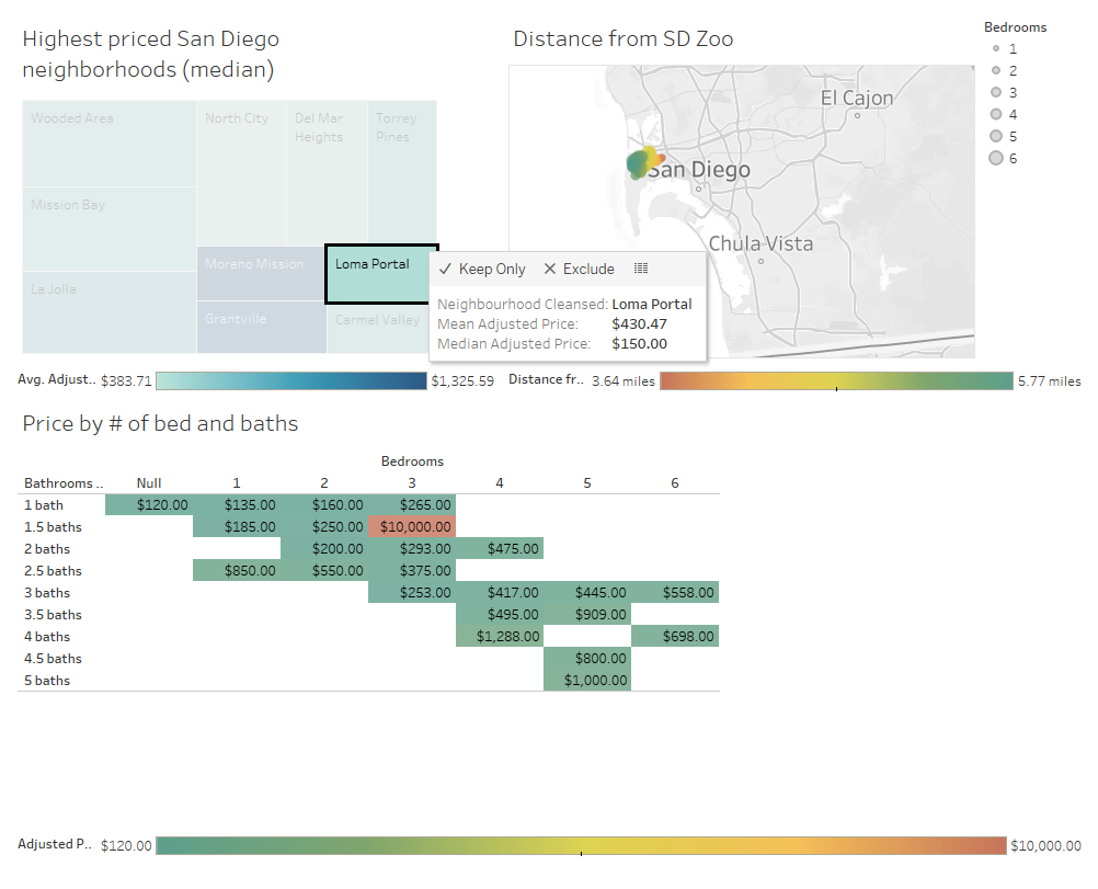
Tableau: Filters on Airbnb Data
In this visualization of San Diego, California Airbnb data, interactivity is worked in through filters. Additionally, geographic data points are used to map out a story for better understanding.
Tableau Story
Tableau: Story
Multiple data visualizations approaching different angles create a data story. Charts and graphs are combined in this file for a compelling analysis of the top books of the last 50 years.